![F61’s bright and bold identity for Habit imagines a world where coffee is its saviour](https://szthekey.oss-cn-shenzhen.aliyuncs.com/wp-content/uploads/2022/06/20220624071806-62b5652e393a5.webp)
![F61’s bright and bold identity for Habit imagines a world where coffee is its saviour](https://szthekey.oss-cn-shenzhen.aliyuncs.com/wp-content/uploads/2022/06/20220624071806-62b5652e47a38.webp)
![F61’s bright and bold identity for Habit imagines a world where coffee is its saviour](https://szthekey.oss-cn-shenzhen.aliyuncs.com/wp-content/uploads/2022/06/20220624071806-62b5652e56a6b.webp)
![F61’s bright and bold identity for Habit imagines a world where coffee is its saviour](https://szthekey.oss-cn-shenzhen.aliyuncs.com/wp-content/uploads/2022/06/20220624071806-62b5652e63948.webp)
![F61’s bright and bold identity for Habit imagines a world where coffee is its saviour](https://szthekey.oss-cn-shenzhen.aliyuncs.com/wp-content/uploads/2022/06/20220624071806-62b5652e6d70d.webp)
![F61’s bright and bold identity for Habit imagines a world where coffee is its saviour](https://szthekey.oss-cn-shenzhen.aliyuncs.com/wp-content/uploads/2022/06/20220624071806-62b5652e78371.webp)
![F61’s bright and bold identity for Habit imagines a world where coffee is its saviour](https://szthekey.oss-cn-shenzhen.aliyuncs.com/wp-content/uploads/2022/06/20220624071806-62b5652e868f8.webp)
在圣彼得堡,一杯咖啡不僅僅是一種簡單的飲品,它承載著情感,為人們的生活定下基調。獨立設計機構F61接受了為“習慣”咖啡品牌設計視覺標識、包裝及通信系統的挑戰,旨在通過創意與活力,將“習慣”品牌“比咖啡更大”的理念傳遞給每一位消費者。
設計理念
F61的設計團隊深刻理解“習慣”品牌背后的情感價值,他們不僅僅是在設計一款咖啡的視覺形象,更是在為人們的生活態度注入新的活力。因此,整個設計過程都圍繞著如何將“習慣”咖啡打造成為生活中的一抹亮色,成為人們在忙碌與壓力中的小確幸。
視覺形象
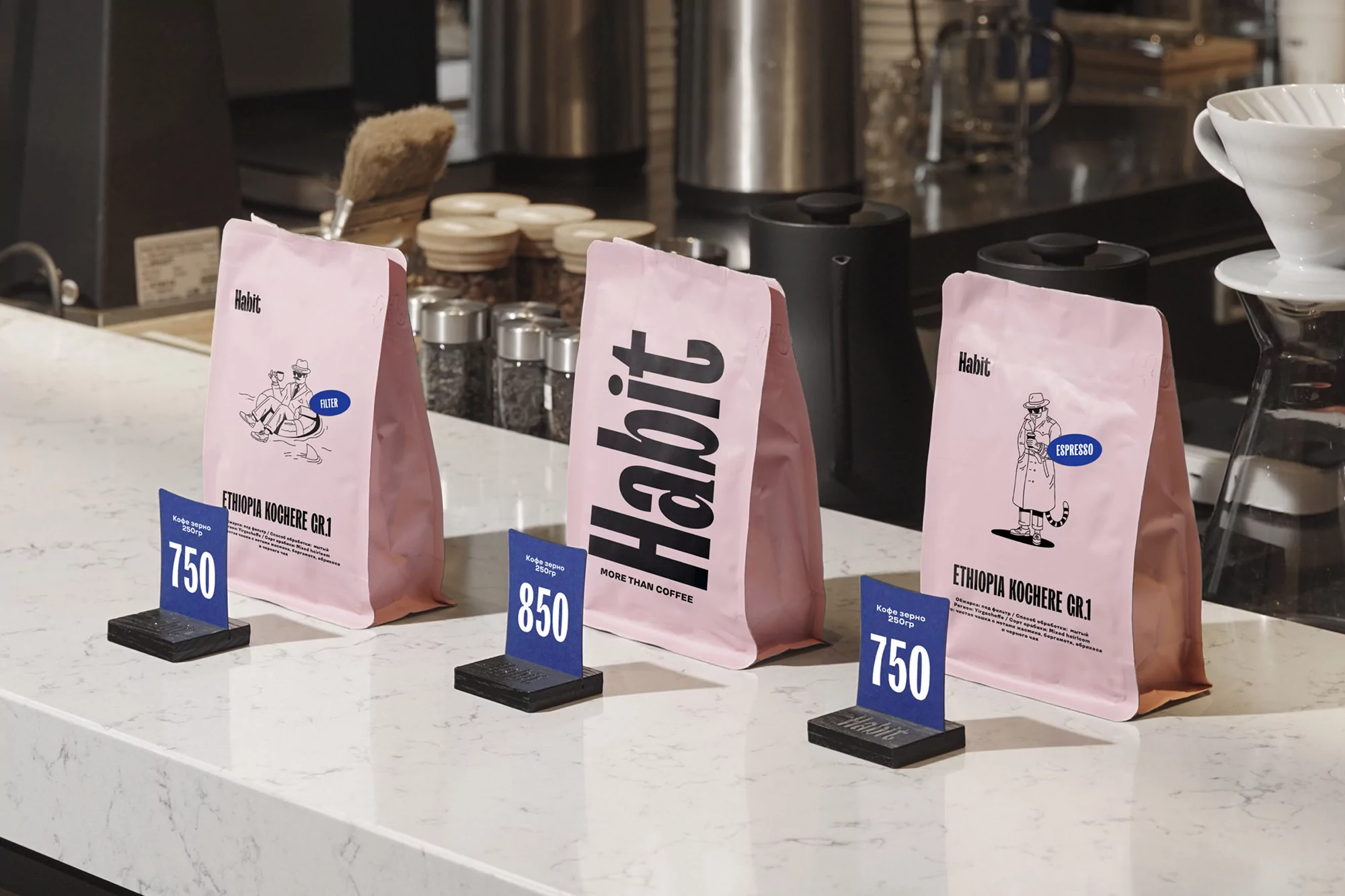
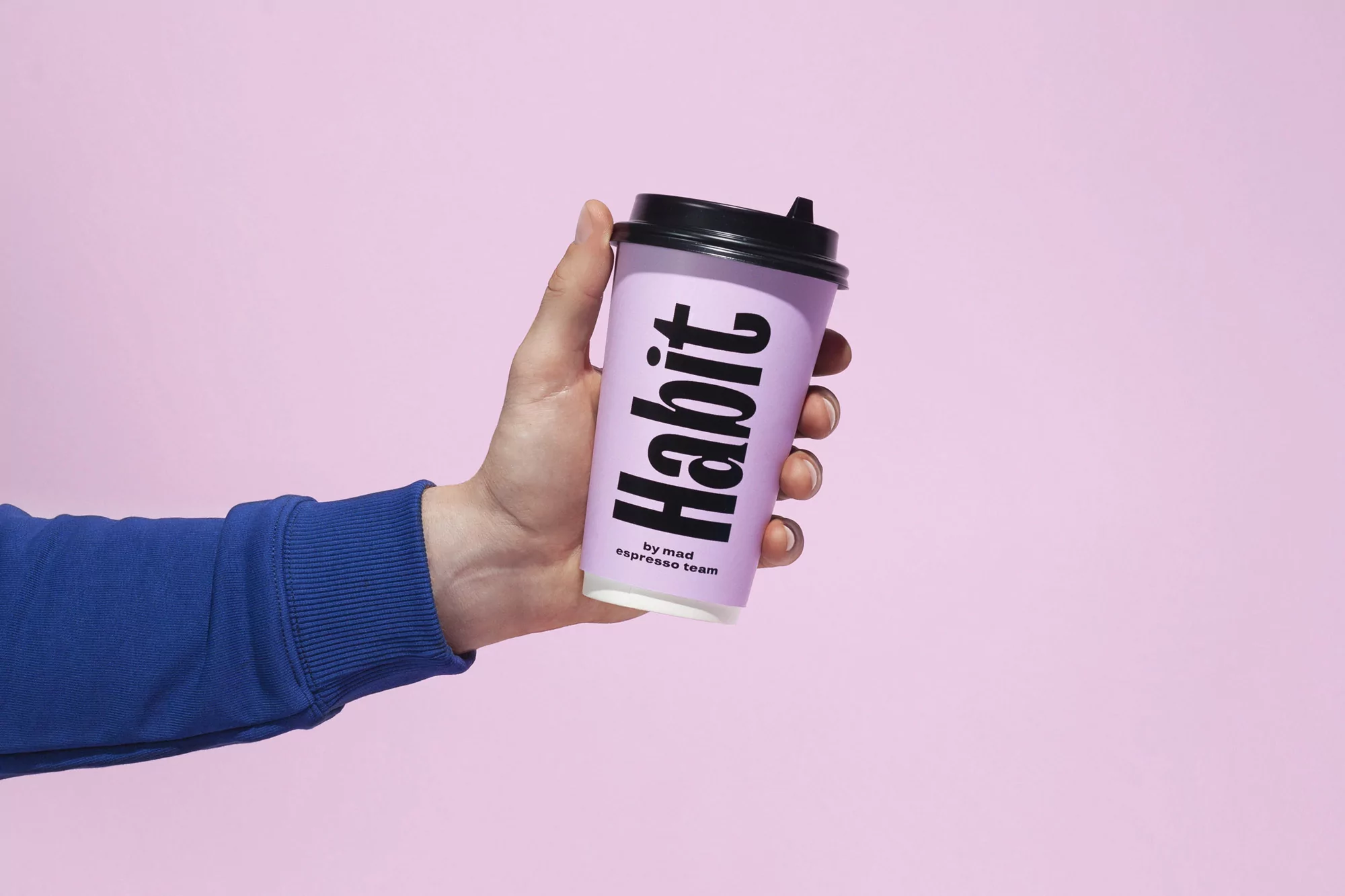
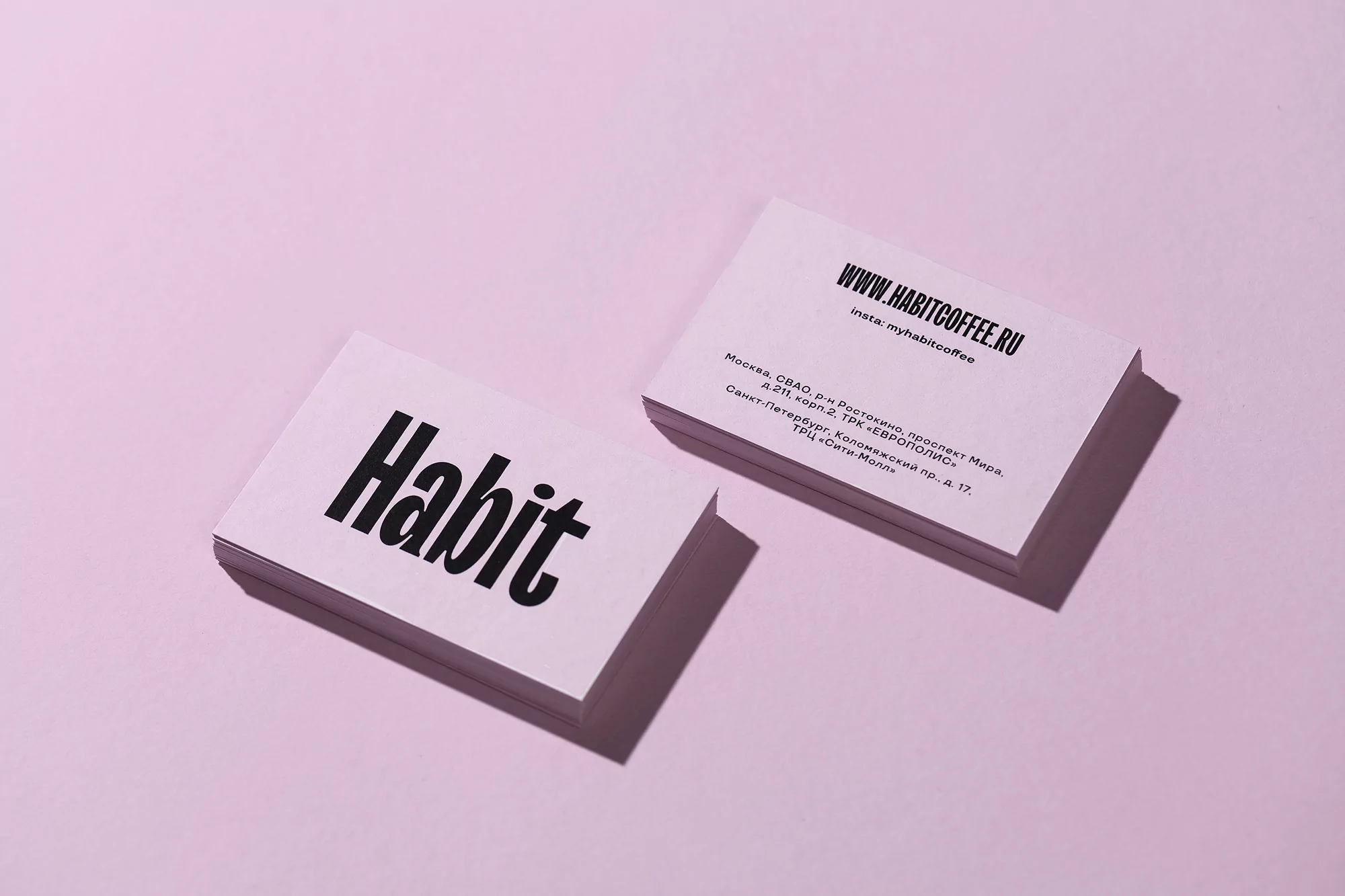
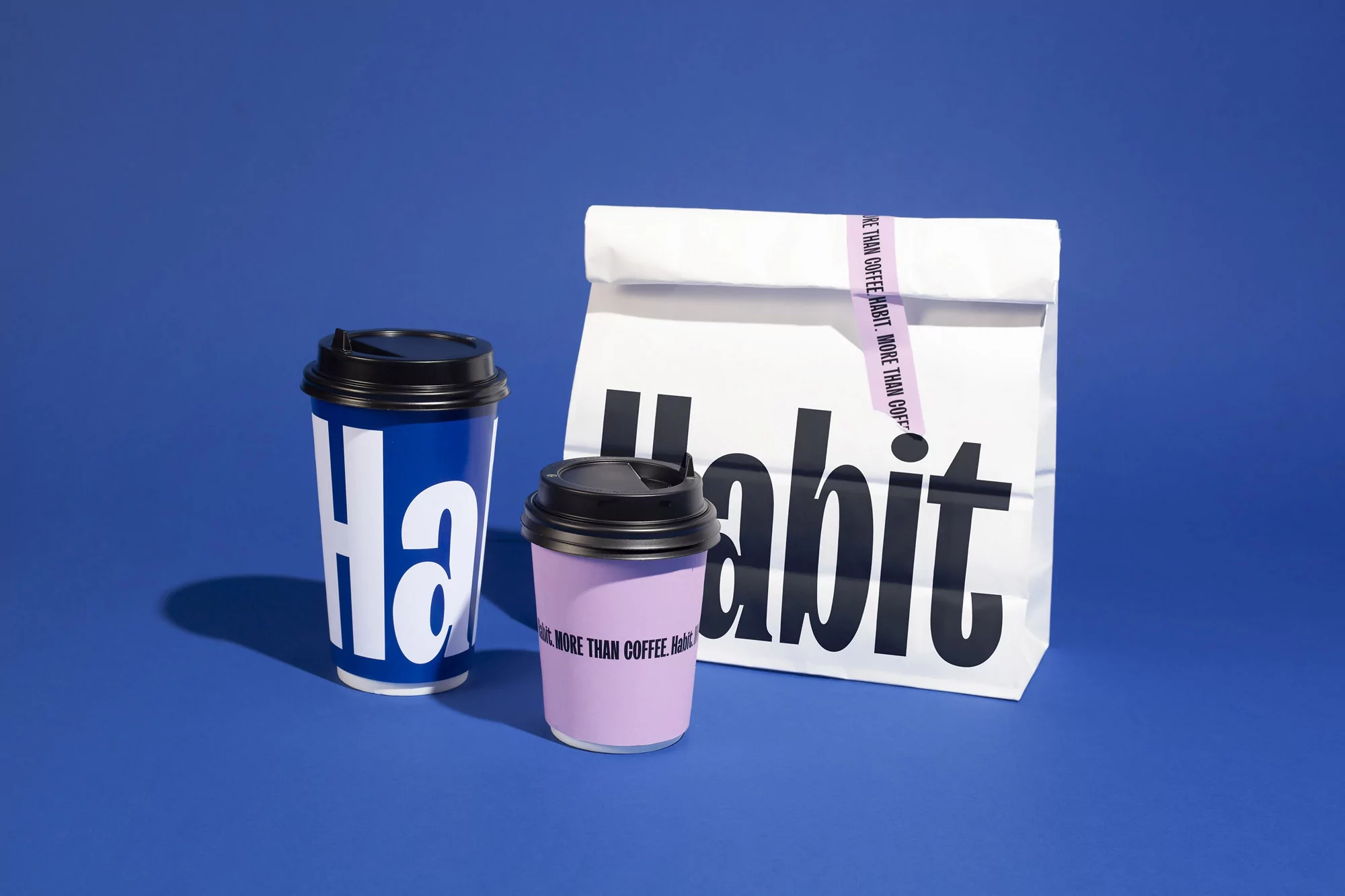
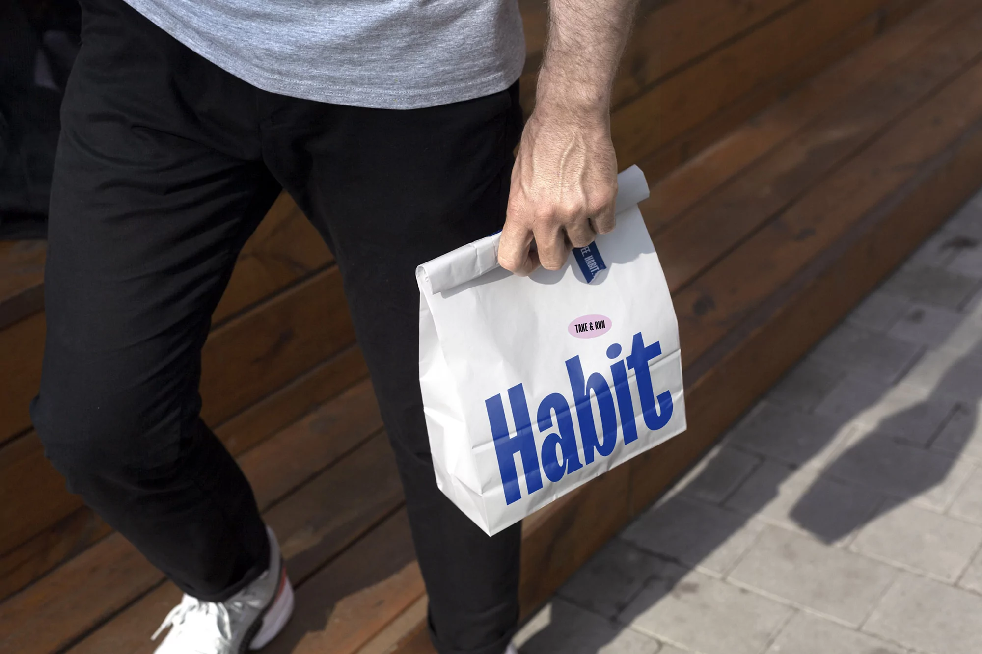
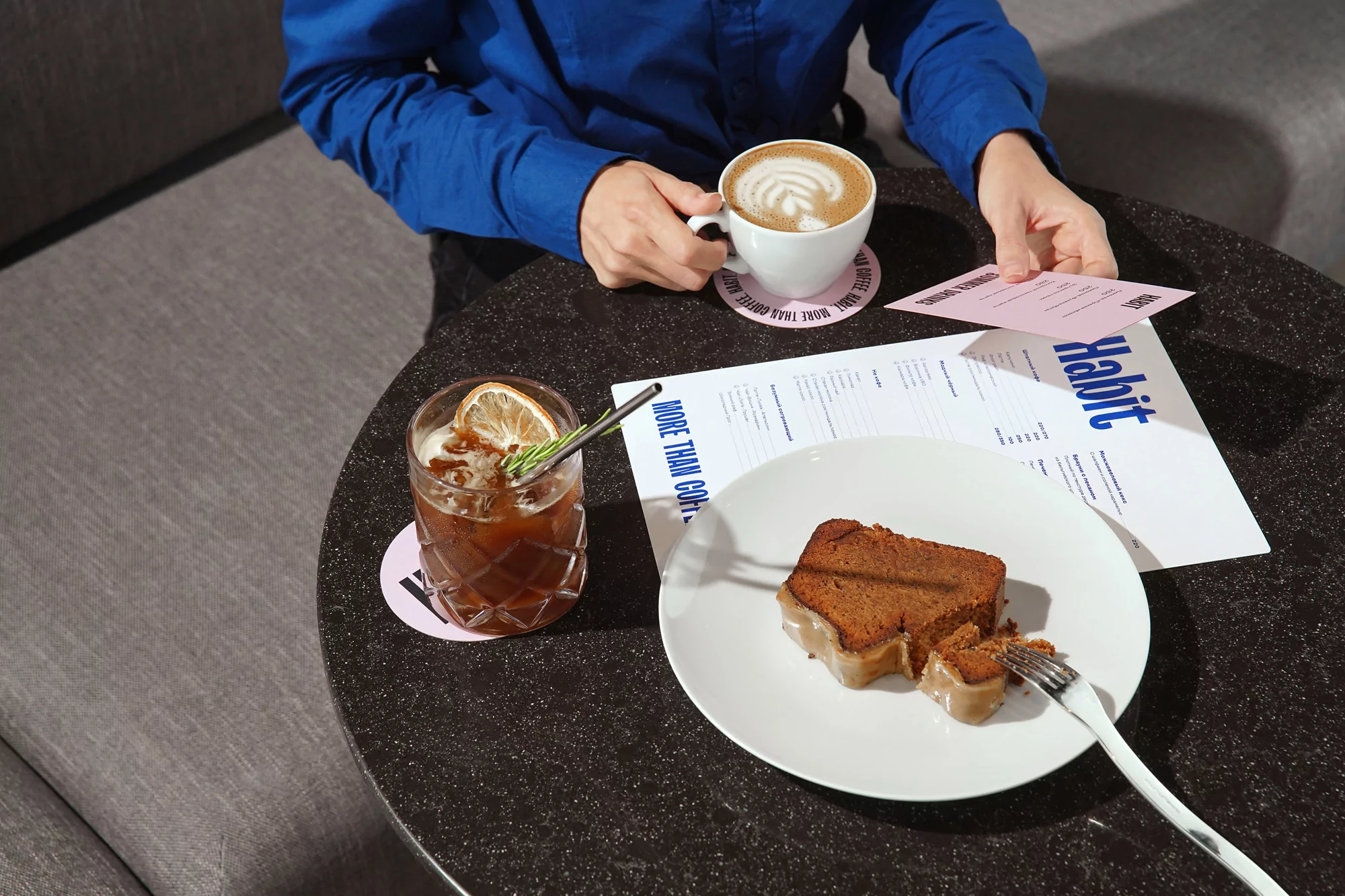
在視覺形象的設計上,F61充分展現了其明亮、大膽的設計風格。文字標記作為核心元素,貫穿于菜單、外賣杯等各個觸點,搭配“不僅僅是咖啡”的口號,以大寫字母排版,營造出一種獨特的視覺沖擊力。同時,粉彩粉和皇家藍作為主色調,為品牌帶來了鮮明的色彩對比,傳遞出品牌年輕、活力的形象。
F61的聯合創始人拉娜·洛馬基納(Lana Lomakina)表示:“我們喜歡有品味的古怪排版,這就像是咖啡的獨特味道。”這種個性化的排版風格不僅增加了品牌的辨識度,也賦予了品牌獨特的個性魅力。
其他內容
除了文字標記和色彩設計外,F61還為“習慣”咖啡設計了一系列富有創意的插圖。這些插圖以“荒謬”、“諷刺”和“有共同的想法”為特點,想象了一個充滿趣味的世界,其中咖啡成為了解決各種問題的臨時救世主。無論是洪水還是僵尸啟示錄,一杯咖啡總能帶給人們片刻的寧靜與安慰。這些插圖不僅豐富了品牌的視覺內容,也加深了消費者對品牌的情感連接。
文章小結
F61為“習慣”咖啡品牌打造了一套充滿活力與創意的品牌形象設計方案。從文字標記到色彩搭配再到創意插圖,每一個細節都體現了F61對品牌理念的深刻理解與獨特詮釋。這套設計方案不僅提升了“習慣”咖啡的品牌形象與辨識度,也為其在競爭激烈的市場中脫穎而出奠定了堅實的基礎。未來,“習慣”咖啡將繼續以這套充滿活力的品牌形象陪伴消費者度過每一個需要咖啡的時刻。